Best practices for your paid social ad creatives
Written by Drew Meyer, Paid Social Manager
It goes without saying that a campaign’s creative is essential to the campaign’s success.
The image, video, or other form of creative is one of the first things a user sees on their feed when they view an ad, or in the case of some platforms such as TikTok, it is the primary focus of the ad itself.
Therefore, it is crucial for creative to be viewed with the same importance as copy and brand identity, as all of these elements work in tandem to create a successful campaign.
With this in mind, here are some top tips on putting together the best quality creative to achieve campaign success:
1. Utilise all available sizes
Each social platform has recommended pixel sizes for ad creatives, for example on Facebook and LinkedIn:
- 1080×1080 – Square
- 1200×628 – Rectangle
- 1080×1920 – Vertical/Story
We often receive a video in one size, usually rectangular and are expected to use it for all ad placements.
However, when translated to a story placement, rectangular video doesn’t fit and looks very out of place. It’s important that your ad fits into the platforms content and placement, if a rectangular creative is used on a story ad it will either show in poor quality or be cut off completely.
To maximise your ads reach and overall success, it is essential that creative is provided in all relevant sizes.
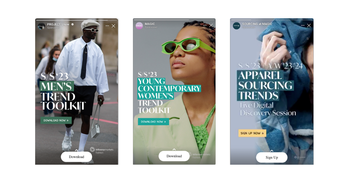
Below are examples of two engaging story ad placements:

2. Utilise a strong Call-To-Action (CTA)
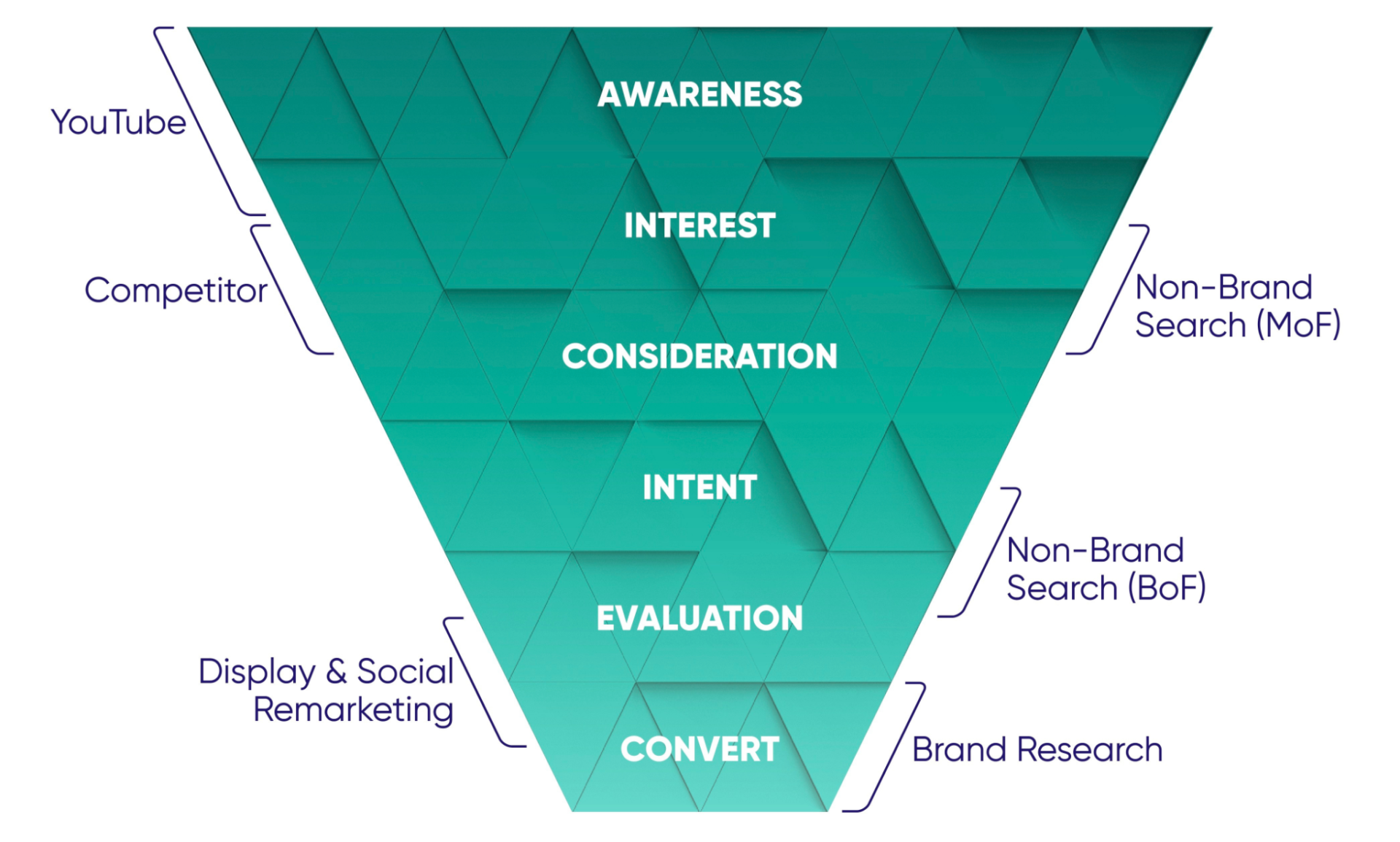
The call to action is what captures a user’s attention the most. Your call to action should be consistent with the stage of the marketing funnel that you are tapping into user-wise.
The main text in the ad should explain what the event is about, as this audience have limited to no prior knowledge of the event. This highlights the importance of the CTA as it invites the user to find out more information and click through to the landing page.
Do you want to learn more about creative best practices? Download our creative best practice guide now.
On the other hand, if a user is being re-marketed to at the bottom of the funnel (BoF), an image with less information and a stronger, more “purchase” or “register” focused CTA would be best practice.
It is important that the text doesn’t take up too much of the ad, as this can lead to low engagement. Images with too much text or lack of images are not visually appealing and this has a negative effect on the ads performance.
Marketing Funnel

3. Utilise assets from your event
If users see an ad for an event in their timeline, and can visualise themselves at the event or can be given a good idea of what will actually be at the event, this can be very effective.
Some creatives fall victim to being nondescript and giving a limited idea of what the event will entail. This can be easily avoided by previous show imagery either displayed in a carousel or worked into banner ads.
Event imagery are more visually interesting, and when combined with strong messaging and punchy text, can lead to successful performance from your ads and a great campaign!
The Tag Digital team keep up to date with updated best practices on all platforms. If you would like to get notified when we publish new content, sign up for our content today.


